
Problem
A new car manufacturing company (name confidential) decided to enter the US car market. They needed to set up a car manufacturing unit in the US so vehicles could be produced locally and sold at a competitive price in the US market.
They needed to understand the factors on which the pricing of cars depends. The main aim is to understand
- Factors those are important in deciding price of a car
- How well those factors describe the price of a car
The company has collected a large dataset of different types of cars across the US market. I will only use a small portion of the dataset for demonstration purposes.
Goal
Help management to understand what features affects the vehicle price in the US market. Build a model to predict the car price with the available independent variables (features) and discard unimportant variables for defining vehicle price. The management will use the model to understand how exactly the prices vary with the car features. Management then can make an informed decision when designing/manufacturing vehicles to meet certain price levels.
This model will be a good way for management to understand the pricing dynamics of the US market.
Implementation
Import python libraries for data and visualisation.
import warnings
warnings.filterwarnings('ignore')

#importing the libraries
import numpy as np
import pandas as pd
import matplotlib.pyplot as plt
import seaborn as sns

from sklearn.model_selection import train_test_split
from sklearn.feature_selection import RFE
from sklearn.linear_model import LinearRegression
import statsmodels.api as sm
from statsmodels.stats.outliers_influence import variance_inflation_factor
from sklearn.metrics import r2_score
Step 1: Reading and Understanding the Data
Let’s start with the following steps:
- Importing data using the pandas library
- Understanding the structure of the data
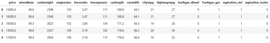
cars = pd.read_csv('Car_Price.csv')
cars.head()
cars.shape
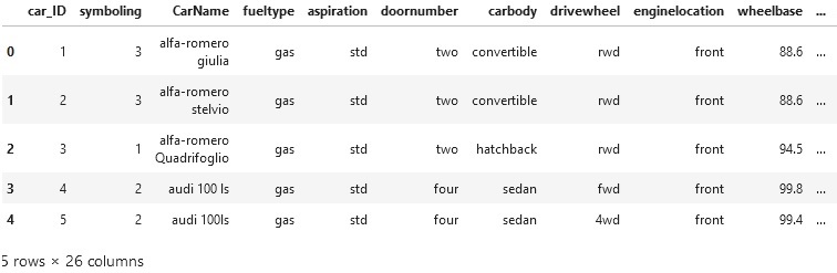
Pandas DataFrame head() method returns the top n rows of a DataFrame or Series where n is a user input value. The head() function is helpful for quickly testing if your object has the correct type of data in it.
Check dataset description
cars.describe()
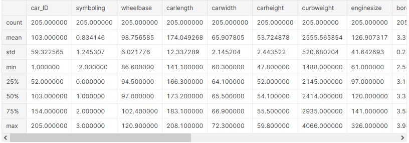
The describe() method computes and displays summary statistics for a Python dataframe. (It also operates on dataframe columns and Pandas series objects.)
Step 2 : Data Cleaning and Preparation
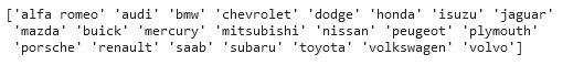
Let’s look at the column ‘CarName’ to ensure car brand names are correct. Get the list of all unique cars’ brand names.
carNames = cars['CarName'].unique()
print(carNames)
Output:
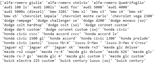
As you can see from the CarName column, cars’ brands and models are mostly combined. Let’s remove the model names from the CarName column and rename the column from CarName to Brand.
#remove model name from the carName column
cars['CarName'] = cars['CarName'].apply(lambda x : x.split(' ')[0])

#rename column CarName to Brand
cars = cars.rename(columns={"CarName": "Brand"})

# Get the unique Brand names to make sure data is correct
print(cars['Brand'].unique())
Output:
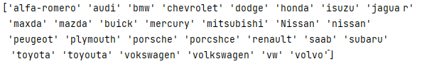
As we can see from the output, some brands have the wrong spelling. i.e. ‘porsche’ ‘porcshce’, ‘toyota’ ‘toyouta’ and Volkswagen has three different spellings ‘vokswagen’ ‘volkswagen’ ‘vw’. Let’s correct the wrong brad names.
# Correct the brand name spelling
cars = cars.replace({'porsche': 'porsche'})
cars = cars.replace({'porcshce': 'porsche'})
cars = cars.replace({'toyouta': 'toyota'})
cars = cars.replace({'vokswagen': 'volkswagen'})
cars = cars.replace({'vw': 'volkswagen'})
cars = cars.replace({'Nissan': 'nissan'})
cars = cars.replace({'maxda': 'mazda'})
cars = cars.replace({'alfa-romero': 'alfa romeo'})

print(cars['Brand'].unique())
Output:
Step 3: Visualise the Data
Data visualisation gives a clear idea of the information by providing visual context through maps or graphs. This makes the data more natural for the human mind to comprehend and therefore makes it easier to identify trends, patterns, and outliers within large data sets.
There are several data visualisation methods available. I will visualise car Price distribution to check if the data is skewed.
plt.figure(figsize=(12,6))

plt.subplot(1,2,1)
plt.title('Car Price Distribution')

sns.distplot(cars.price, color="y")

plt.subplot(1,2,2)
plt.title('Car Price Spread')
sns.boxplot(y=cars.price, color="y")

plt.show()
Output:

# Check how car price is distributed
print(cars.describe(percentiles = [0.10, 0.20, 0.30, 0.40, 0.50, 0.60, 0.70, 0.80, 0.90,1]))

We can observe a few things from the above graph and price distribution.
- From the graphs, we can see that data is right skewed, meaning most car prices in the dataset are beloe 17,493
- Data points are far spread out from the meanm which means there is high variance in tge car price. Around 80% of the car price is below 17,493.
Step 3.a Find most popular vehicle by features
# Check most popular car brand
print(cars['Brand'].value_counts())
sns.countplot(data=cars, x='Brand', order=cars['Brand'].value_counts().index)

# Check most popular fuel type

# Check most popular car type/shape
plt.show()
By car brand:
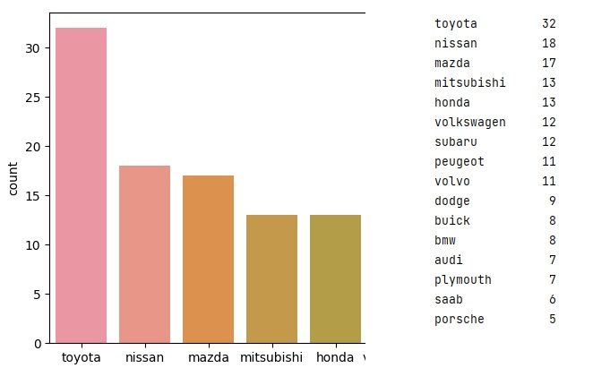
From the above graph, it is clear that Toyota is the most popular car brand, followed by Nissan in the US. Now let’s see the most popular car in terms of Fuel Type, Car body, Symboling, Engine type etc.
By other features in the dataset
plt.subplot(1,2,2)
sns.countplot(data=cars, x='fueltype', order=cars['fueltype'].value_counts().index)

plt.subplot(1,2,2)
sns.countplot(data=cars, x='carbody', order=cars['carbody'].value_counts().index)

plt.subplot(1,2,2)
sns.countplot(data=cars, x='symboling', order=cars['symboling'].value_counts().index)

sns.countplot(data=cars, x='enginetype', order=cars['enginetype'].value_counts().index)
plt.show()
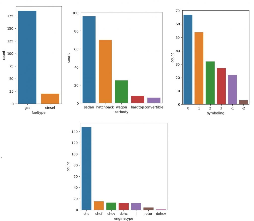
From the above graphs, we can observe a few things
- Most popular fuel type is gas
- Sedan is the most popualer car type
- US market favour symboling 0 and 1 most
- Most popular engine type is Overhead Camshaft engines (OHC)
Step 3.b Find most expensive vehicle by features
plt.figure(figsize=(25, 6))
df = pd.DataFrame(cars.groupby(['Brand'])['price'].mean().sort_values(ascending = False))
df.plot.bar()
plt.title('Brand vs Average Price')

df = pd.DataFrame(cars.groupby(['fueltype'])['price'].mean().sort_values(ascending = False))
df.plot.bar()
plt.title('Fuel Type vs Average Price')
plt.tight_layout()
plt.show()

df = pd.DataFrame(cars.groupby(['carbody'])['price'].mean().sort_values(ascending = False))
df.plot.bar()
plt.title('Car Type vs Average Price')
plt.tight_layout()
plt.show()

df = pd.DataFrame(cars.groupby(['enginelocation'])['price'].mean().sort_values(ascending = False))
df.plot.bar()
plt.title('Engine size vs Average Price')
plt.tight_layout()
plt.show()
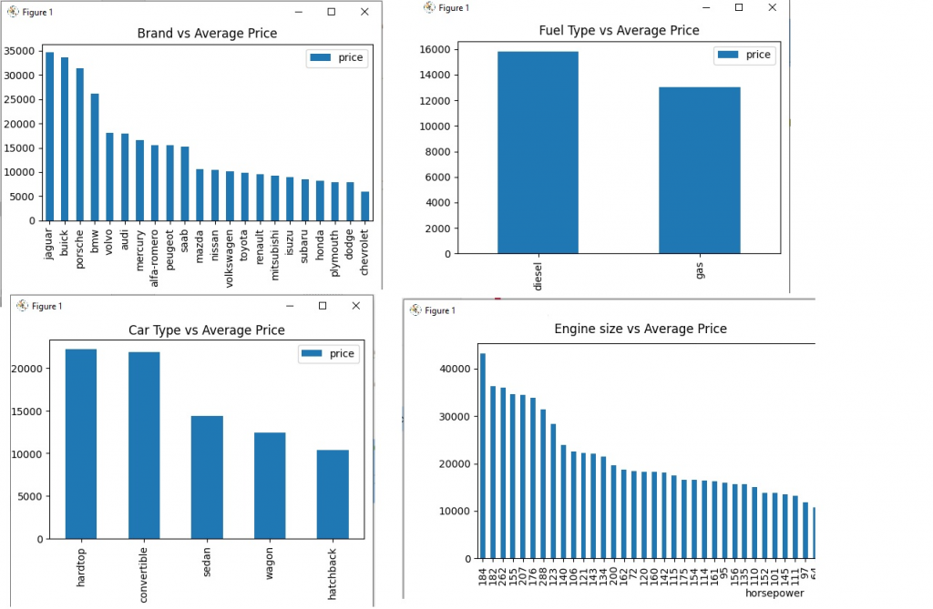
The conclusion from the above graphs
- Jaguare and Buick are most expensive cars while Chevrolet and dodge are lest expensive
- Diesel engine are more expensive than gas
- Hardtop and convertables are more expensive cars
- Higher the horse power, more expensive is car
Step 3.c Most popular vehicle by features
Let’s create some graphs to understand the most popular cars by their features and their relationship with the price of the vehicle.
fig, axes = plt.subplots(4, 2, figsize=(12, 10))
fig.suptitle('Boxplot')
sns.countplot(ax=axes[0, 0], data=cars, x='enginelocation')
sns.boxplot(ax=axes[0, 1], data=cars, x='enginelocation', y='price')

sns.countplot(ax=axes[1, 0], data=cars, x='cylindernumber')
sns.boxplot(ax=axes[1, 1], data=cars, x='cylindernumber', y='price')

sns.countplot(ax=axes[2, 0], data=cars, x='fuelsystem')
sns.boxplot(ax=axes[2, 1], data=cars, x='fuelsystem', y='price')

sns.countplot(ax=axes[3, 0], data=cars, x='drivewheel')
sns.boxplot(ax=axes[3, 1], data=cars, x='drivewheel', y='price')
plt.tight_layout()
plt.show()
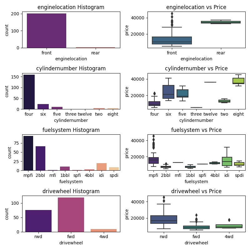
The conclusion from the above graphs
- Most ppopular cars are front wheel drive and cheaper as compared to rear wheel drive
- There are very few rear wheel drive cars
- Most popular cylinder are four, five and six and cheapest
- Eight cylinder cars has highest price range and not very populer
- Most popular fuel system are mpfi (Multi point fuel injection) and 2bb (two barrel carbs)
Step 3.d ScatterPlot visualisation of numerical data by features
fig, axes = plt.subplots(4, 3, figsize=(12, 10))
fig.suptitle('Scatter plot visualisation of numerical data by features')

sns.scatterplot(ax=axes[0, 0], data=cars, x='carlength', y='price')
sns.scatterplot(ax=axes[0, 1], data=cars, x='carwidth', y='price')
sns.scatterplot(ax=axes[0, 2], data=cars, x='carheight', y='price')

sns.scatterplot(ax=axes[1, 0], data=cars, x='curbweight', y='price')
sns.scatterplot(ax=axes[1, 1], data=cars, x='enginesize', y='price')
sns.scatterplot(ax=axes[1, 2], data=cars, x='boreratio', y='price')

sns.scatterplot(ax=axes[2, 0], data=cars, x='stroke', y='price')
sns.scatterplot(ax=axes[2, 1], data=cars, x='compressionratio', y='price')
sns.scatterplot(ax=axes[2, 2], data=cars, x='horsepower', y='price')

sns.scatterplot(ax=axes[3, 0], data=cars, x='wheelbase', y='price')
sns.scatterplot(ax=axes[3, 1], data=cars, x='citympg', y='price')
sns.scatterplot(ax=axes[3, 2], data=cars, x='highwaympg', y='price')

plt.tight_layout()
plt.show()

- Features carwidth, carlength, curbweight, engineSize, boreratio, horsepower and wheelbase have positive correlation with price
- carheight doesn’t have any correlation with price.
- citympg and highwaympg have negative correlation with price
List of all features that have a strong correlation with car price
- enginetype
- fueltype
- carbody
- aspiration
- cylindernumber
- drivewheel
- curbweight
- carlength
- carwidth
- enginesize
- boreratio
- horsepower
- wheelbase
- citympg
- highwaympg
Let’s remove other features from the DataFrame and only keep those that correlate with the car price and draw a pair-plot graph.
cars = cars[['fueltype', 'aspiration','carbody', 'drivewheel','wheelbase',
                'curbweight', 'enginetype', 'cylindernumber', 'enginesize', 'boreratio','horsepower',
                'carlength','carwidth', 'citympg', 'highwaympg', 'price']]
sns.pairplot(cars)
plt.tight_layout()
plt.show()

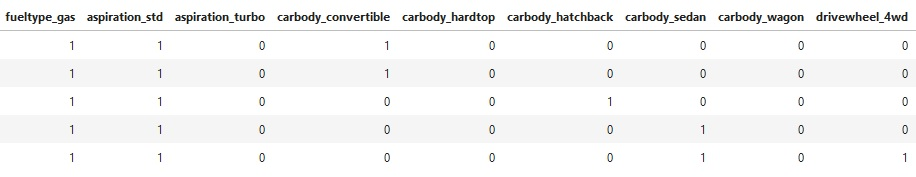
Step 4. Convert categorical variables into columns
One of the significant problems with machine learning is that many algorithms cannot work directly with categorical data. In the step of data processing in machine learning, we often need to prepare our data in specific ways before feeding it into a machine learning model. One of the examples is to perform a One-Hot encoding on categorical data.
Therefore, we need a way to convert categorical data into a numerical form for machine learning algorithms can take in that as input. Dummy Variable Encoding is of many methods of converting into numerical data. (Ex: [‘fueltype’, ‘aspiration’, ‘carbody’, ‘drivewheel‘, ‘enginetype’, ‘cylindernumber‘]) into separate columns of 0s and 1s.
Pandas pd.get_dummies() will turn categorical column (column of labels) into indicator columns (columns of 0s and 1s).
dummy = pd.get_dummies(cars[['fueltype','aspiration','carbody','drivewheel','enginetype','cylindernumber']])
cars = pd.concat([cars, dummy], axis=1)
pd.options.display.max_columns = None
print(cars.head())
Let’s remove fueltype, aspiration, carbody, drivewheel, enginetype, cylindernumber
cars = cars.drop(columns=['fueltype','aspiration','carbody','drivewheel','enginetype','cylindernumber'])
cars.head(cars.shape[0])
Step 5 Transform the data
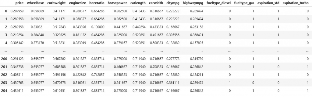
Standardisation of a dataset is a common requirement for many machine learning estimators: they might behave badly if the individual features do not more or less look like standard normally distributed data (e.g. Gaussian with 0 mean and unit variance).
Many machine learning algorithms perform better when numerical input variables are scaled to a standard range. This includes algorithms that use a weighted sum of the input, like linear regression and algorithms that use distance measures, like k-nearest neighbours.
The two most popular techniques for scaling numerical data before modelling are normalisation and standardisation. Normalisation scales each input variable separately to the range 0-1, the range for floating-point values where we have the most precision. Standardisation scales each input variable separately by subtracting the mean (called centring) and dividing by the standard deviation to shift the distribution to have a mean of zero and a standard deviation of one.
This is the standard procedure to scale our data while building a machine learning model so that our model is not biassed towards a particular feature of the dataset..
scaler = MinMaxScaler()
num_vars = ['wheelbase', 'curbweight', 'enginesize', 'boreratio', 'horsepower', 'citympg', 'highwaympg', 'carlength','carwidth','price']
cars[num_vars] = scaler.fit_transform(cars[num_vars])
pd.options.display.max_columns = None
print(cars.head())
Step 6. Create correlation heatmap
A correlation heatmap is a graphical representation of a correlation matrix representing the correlation between different variables or features. It can also be defined as the measure of dependence between two other variables. If there are multiple variables, the goal is to find a correlation between all of these variables.
plt.figure(figsize = (25, 25))
sns.heatmap(cars.corr(), cmap="YlGnBu", annot=True)
plt.show()
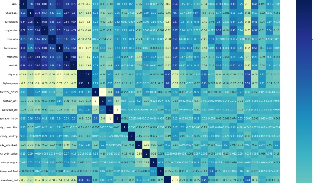
Above heatmap graph shows that curbweight, enginesize, horsepower, carlength and carwidth are highly correlated variables. This means they are the main features that influence the car price. We also evaluate features by Recursive Feature Elimination (RFE) in next step.
Step 7: Split data in train-test and build model
Y = cars.pop('price')
X = cars

np.random.seed(0)
x_cars_train, x_cars_test, y_cars_train, y_cars_test = train_test_split(X, Y, train_size=0.7, test_size=0.3, random_state=100)
Selecting top 10 features by using Recursive Feature Elimination (RFE).
lr = LinearRegression()

lr.fit(x_cars_train,y_cars_train)

#Recursive Feature Elimination (RFE)
# Lets select top 10 features
rfe = RFE(lr, 10)
rfe = rfe.fit(x_cars_train, y_cars_train)

print(list(zip(x_cars_train.columns, rfe.support_, rfe.ranking_)))
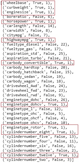
From above recursive feature elimination select only those ranked one and highlighted in the red. We can drop remaining other features. Lets look at the features, how our dataframe will look like when we will select top 10 features.
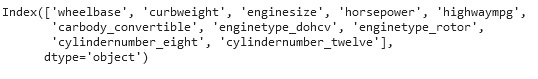
print(x_cars_train.columns[rfe.support_])
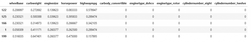
x_cars_train_rfe = x_cars_train[x_cars_train.columns[rfe.support_]]
print(x_cars_train_rfe.head())
Once we have our top features selected, we can create OLS regression result to review our model and further eliminate features.
model = sm.OLS(y_cars_train, sm.add_constant(x_cars_train_rfe)).fit()
model.summary()

OLS regression result helps eliminating any features those are not highly correlated to the price. In the above Regression result, our model prediction is 85%. We can eliminate any features other than enginesize and horsepower, as these two only shows high correlation with the car price.
X_cars_train_new = x_cars_train_rfe.drop(columns=['wheelbase', 'curbweight', 'highwaympg', 'carbody_convertible', 'enginetype_dohcv', 'enginetype_rotor', 'cylindernumber_eight', 'cylindernumber_twelve'])

model = sm.OLS(y_cars_train, sm.add_constant(X_cars_train_new)).fit()
model.summary()
Step 8: Predict car price based on our trained model
lm = sm.OLS(y_cars_train,X_cars_train_new).fit()
y_train_price = lm.predict(X_cars_train_new)
Calculating our prediction model score
r2_score = r2_score(y_cars_test, y_pred)
r2_score
our model score is 82.06%. Based on our prediction model score we can confirm EngineSize and HorsePower features have very high correlation with the car price
Code is available to download from GitHub.